Navdeep UI
A shadcn-compatible library of production-ready React interfaces, crafted with TypeScript, Tailwind CSS, and restrained motion.
Preview the work, inspect the source, and install individual pieces directly from the registry.
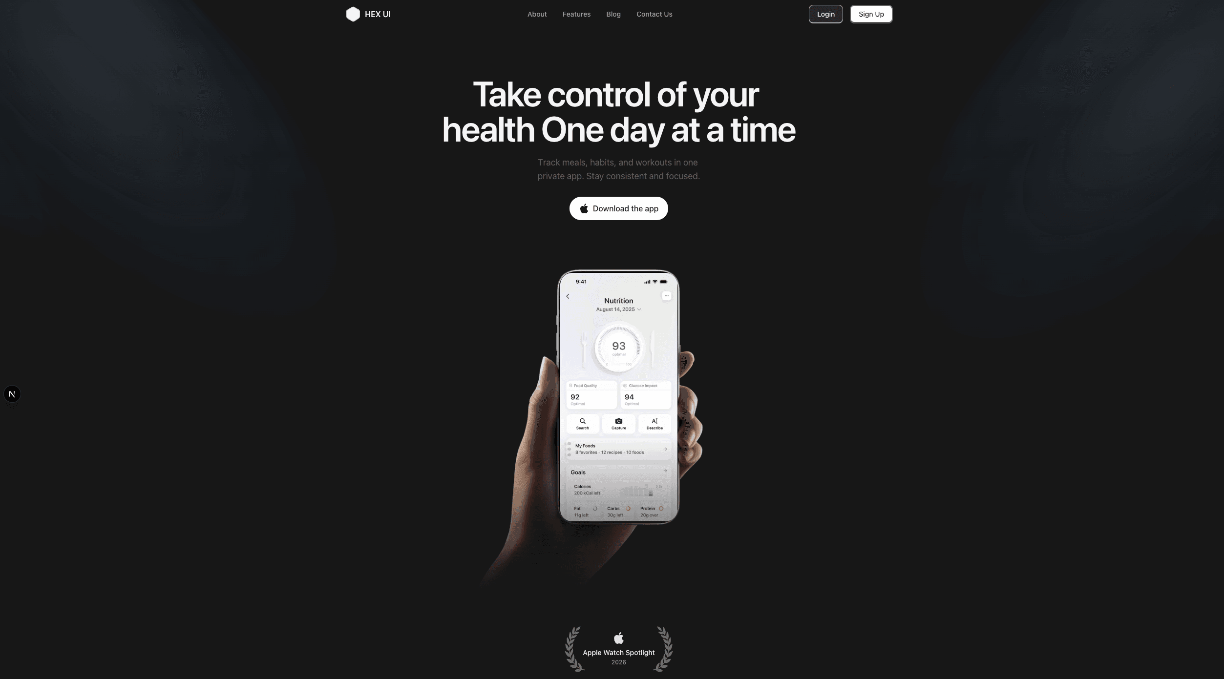
Reusable React components with polished interaction details
Copy-paste components with accessible patterns, restrained motion, and shadcn-compatible registry entries.
Browse componentsSegment Spotlight
A desktop-focused spotlight component for showcasing product features, services, or workflow steps with floating labels and an interactive icon toolbar.
Magnetic Button
A shadcn-compatible button that subtly follows the cursor using spring-based motion.
Animated Tabs
A tab component with a moving active pill and directional content transitions.
Expandable Card
Expandable Card is a reusable interactive card component for showing a compact preview first, then expanding to reveal more details, supporting descriptions, actions, and optional learn-more links.
Rail Nav
A compact right-side rail navigation for long docs, case studies, and portfolio pages with scroll-aware active states.
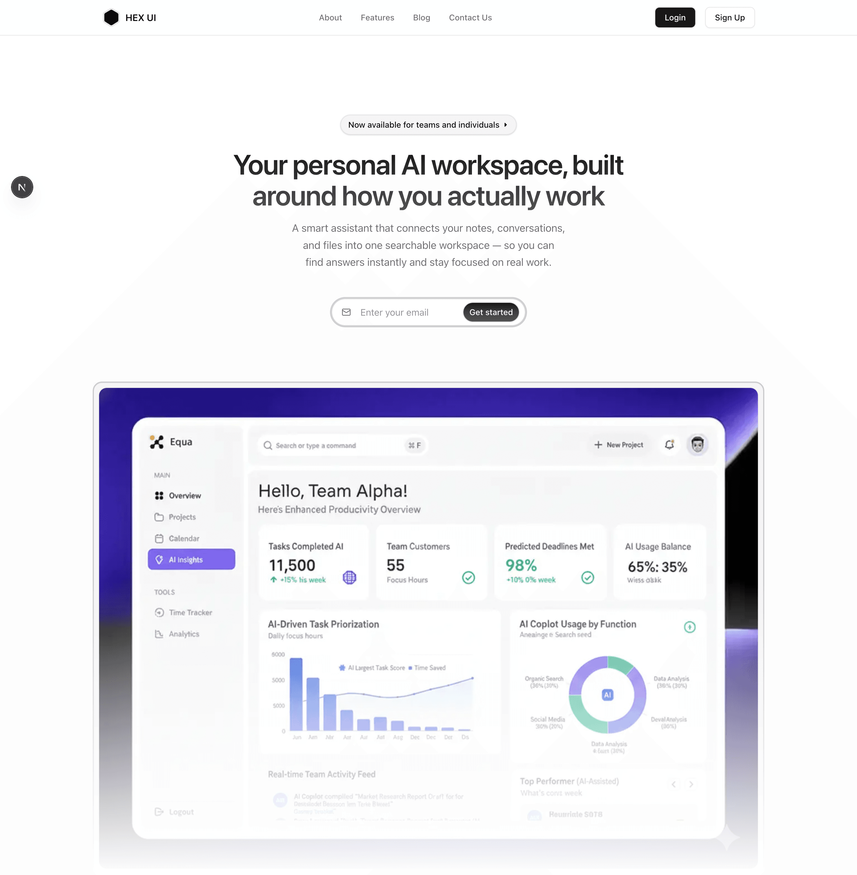
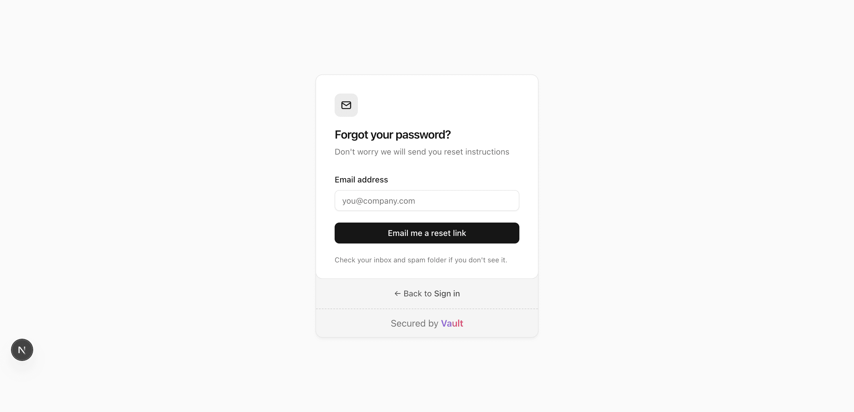
Production-ready sections for real products
Reusable page sections with live previews, source drawers, and registry installs.
Explore blocks